FLEX Pro: Introducing the Header and Footer Designer
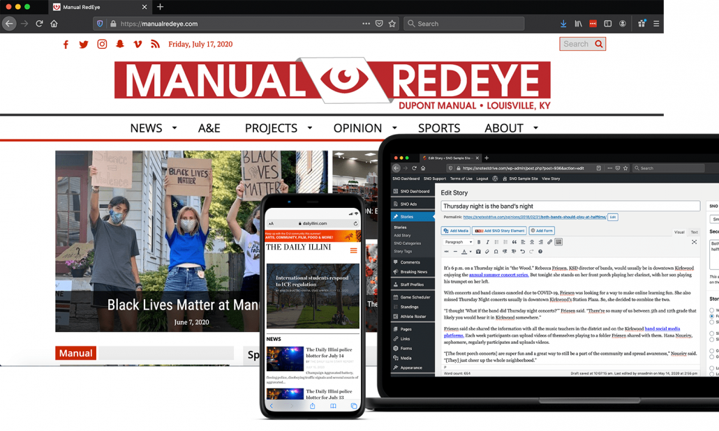
If you thought you had a lot of flexibility before, you’re about to have even more now. A big driving factor of the FLEX Pro theme update was giving you the ability to break away from the old structures of your website — the six Widget Area Configurations (more on that next week), the above or below choices around your Header Area and standardization of your Footer.
It’s time to rethink how those spaces are designed. You’ll now be able to choose your own adventure with the Header and Footer Area Designer.
Here’s some more information about the Header and Footer Design features:
-
Located within the Site Designer tool, you’ll be able to start using the Header and Footer drag-and-drop design features by clicking “Import Existing Settings” in either area. In doing so, the website will replicate the existing area.
-
There are upwards of 30 different content types you’ll be able to work into your Header and Footer areas — a huge expansion from your existing options.
-
New content types include the Marquee, Headline Carousel, new social icons and search bars, Buttons, new menu types, images/advertisements and more.
-
Header and Footer designs are built around columns and rows within columns. Add as many as you want.
-
In “Importing Existing Settings,” your site will replicate your existing Header and Footer using what are called “Legacy” elements. However, there’s much more to explore, including new menu types with vast sets of options to replace legacy features.
-
Some elements have minimum widths and heights that must be met within the areas you’re trying to set them in order to be used.
See the features in action by attending one of our free, 15-minute webinars over the next couple of weeks. View the webinar schedule here.