The SNO Report: Site Booster US & World Maps
We’re willing to bet that over the past two years, many of your programs have written about one, if not both of the following topics: COVID-19 and the 2020 presidential election.
We also feel pretty confident in betting that those articles your staffs wrote included some comparative data, whether it be quantitative or qualitative. Think number of COVID cases per state, presidential candidate, etc.
 We have one final bet to place. Out of the coverage that came together on these topics, only a small percentage included a geographic chart or infographic to help readers visually comprehend that data. If your staff falls into that category, we have a new way to help.
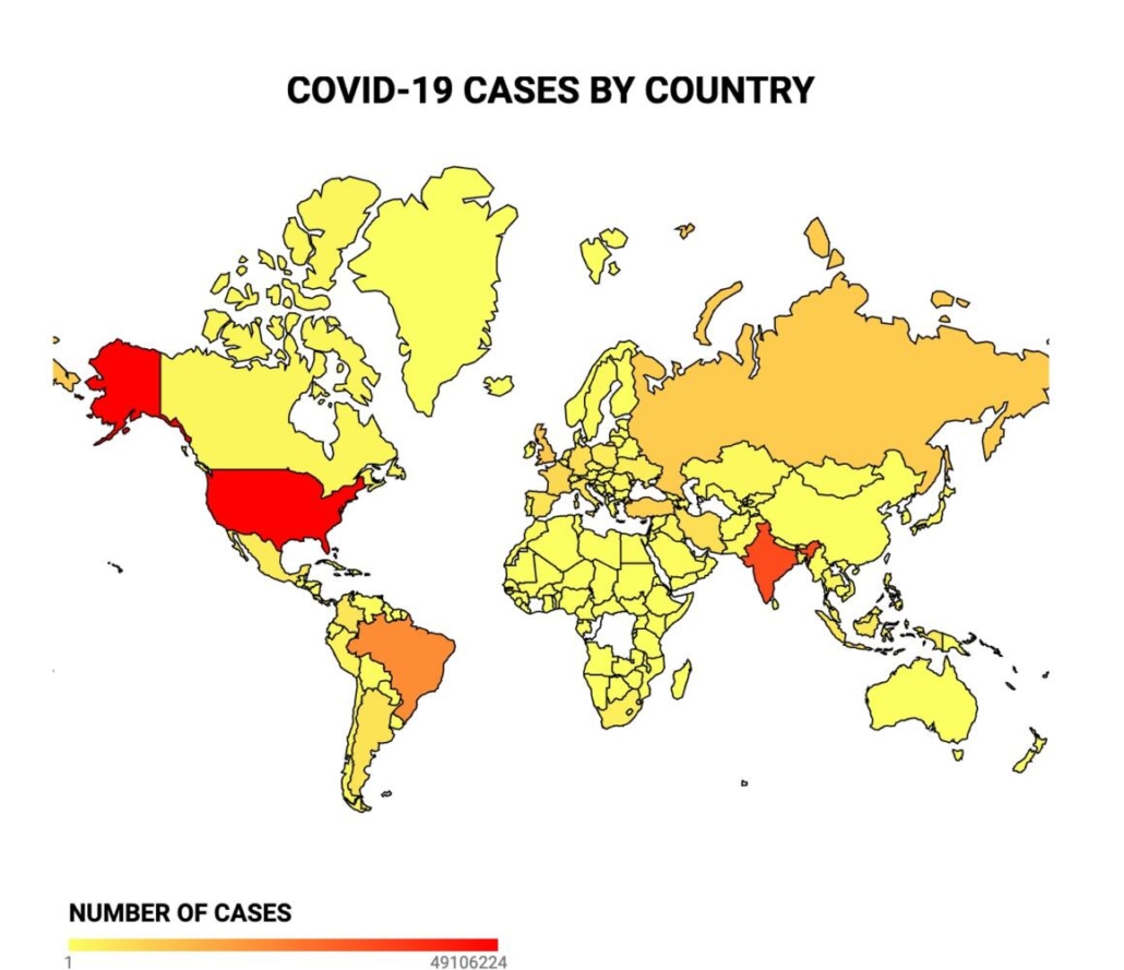
Over the past few weeks, we’ve introduced two new additions to the SNO infographic family: U.S. and World Maps. Here are some of the highlights…
-
A user-guided interface based on whether your data is quantitative or qualitative
-
The ability to show multiple datasets at once allows for more a comprehensive display
-
Overlay and hover effects make the maps feel more interactive to your readers
-
Various gradient and color key options are available to optimize data presentation
-
A CSV uploader allows large datasets to be imported in seconds
-
Maps can be embedded in articles as SNO Story Elements or as a standalone widgets
While these features might sound great in text, to avoid hypocrisy, we’ve also gone ahead and created some examples to back our claims up. You can view them here.
You may also wonder why we’ve been pushing these interactive elements so much over the past few months. Here’s the answer: At SNO, we want to help empower and prepare the next generation of aspiring journalists for entering the profession as best we can. And what’s currently trending in the realm of journalism? You guessed it… Data.
Because of greater data availability, preferences from audiences for visual-driven information, and the rise of misinformation to which data can be used as a means of fact-checking, data-driven journalism has recently emerged as one of the most prominent industry trends.
Colleges and universities are now incorporating data-based journalism courses into their curricula, graphics teams and departments are expanding, and publications are on the lookout for data journalists. In other words, we want to help give your students a leg-up.
And while the idea of working with data can be intimidating, it doesn’t have to be.
Writing an article about your school’s mask mandate? Why not do some research about what other states’ guidelines are and display that information in a U.S. map? Putting together a climate related article? A quick search for global weather data will turn up tons of results to fold into a global map.
If you ease in gently and begin to make data incorporation a normal step in your writing process, we promise it doesn’t have to be scary.
Ready to give these new tools a try? Order our Site Booster Bundle here to get started.