The SNO Report: New Changes To The Design Options Interface & An Addition To The SNO Sites Team
Considering all that 2020 has thrown at us, it may have been a bit more challenging to come up with what you were thankful for around your Thanksgiving table this year. With that in mind, we’re coming to your inbox today with an update that we believe is nothing less than gratitude-worthy.
Last week, while many of you were sitting around eating turkey or simply taking the opportunity to veg out, we released a FLEX theme update to all sites that includes a total rebuild of the SNO Design Options Page.
Let’s talk about it.
Why?
The new editing interface on the SNO Design Options page is designed to be easier to work with and make it easier to preview design changes before they take effect. Gone are the days of tediously toggling back and forth between two different tabs to see your changes in action.
The page also now features click-through links, creating simple redirects for when one of your editing steps inevitably leads to another. For example, say you’re changing the design of your staff profile page and realize you want to reorder your profiles. With the click of a button, you’ll be taken to the appropriate place to make those changes. Keep an eye out for these green and blue buttons scattered throughout the Design Options interface.
What’s changing immediately?
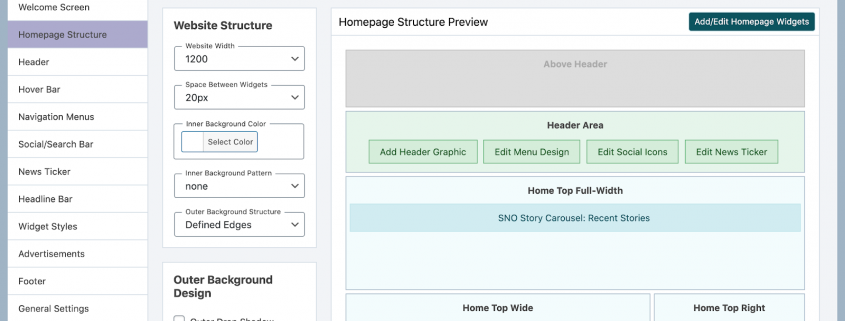
The way that the page now works is that all design sections appear as tabs on the left which correspond to different areas on your homepage and editable non-home pages.
These sections have been reorganized in a top-down manner. In other words, as you proceed through the sections, you will be editing elements that come one after another on your homepage. Think header before hover bar, widget styles before footer, etc.
As far as saving the work that you do, you are free to click through the tabs and make as many changes as you want prior to hitting the “Save All Design Options” button in the top right corner. Your work will be temporarily stored, so it is not necessary to click on it every time you navigate to a new tab.
Other notable improvements
Many changes will occur in the first section at the top, the Homepage Structure tab. While it contains website width, outer and inner browser controls and overall widget configuration options, the really cool new feature here is on the right. This area gives you a preview of what your homepage looks like, including what widget areas are in use and what widgets are occupying those spaces, making it much easier to conceptualize how your homepage is organized.
The Widget Styles section has also been overhauled. Now, as you customize the appearance of a widget style, a simulator to the right allows you to preview those updates in real time, a vast improvement from the previous mini previews.
Finally, we’ve built a time-saving tool into the Fonts section as well. Not sure what a particular font looks like? Simply click on the “View Sample” button to see it in action. Say goodbye to long search sessions through the depths of the Google Font library.
Still have questions?
Since this update is pretty major, we understand that you’ll probably have remaining questions, no matter if it’s later today or a few weeks from now. Ask away. Or, check out this handy SNO Design Options Overview video that demos some of the features from this update.
On an unrelated note
 Last, but certainly not least, we have some exciting news from the SNO headquarters! Alex McNamee, one of the Education and Training Specialists here at SNO, had a baby boy on Nov. 16. Please join us in welcoming Rory Lee McNamee to the SNO Sites team!
Based on the attention that we’ve seen Alex devote to some of your SNO site overhauls, we can only imagine how much attention baby Rory is getting and how great of a father Alex will be.

