Learn about the overhauled Widgets interface
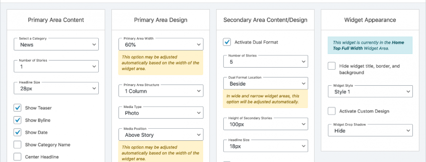
This fall, you may start to notice changes to your Widget Control Panel, like a full-screen editing interface and a widget called the Story List. We launched this FLEX update to all sites last spring.
Let’s review.
Why?
The new editing and customization interface on the Widget Control Panel is designed to be easier to work with and make it easier to find options. It’s also been built to work seamlessly within WordPress’s Customize Live screen, which wasn’t the case in the past.
The Widget Control Panel may look mostly unchanged initially (except for some renamed widgets and a reorganized widgets list), but now when you click to edit a widget, you’ll see the new full-screen editing view. The new view removes distractions and presents your editing options in a clearer, easier to navigate space.
What’s changing immediately?
We’ve completely redesigned a few widgets in particular that hadn’t been touched for years. If you’re currently using any SNO sports (scores, schedules, standings), Trending Stories or Staff Profile widgets, you’ll notice changes right away.
Our sports widgets have taken on the biggest changes of the three and now can be customized with far more options than ever before.
Perhaps the best improvement to the SNO sports, Trending Stories and Staff Profile widgets is that they now can display content tiles side by side to maximize the space in wider areas. Better yet, they’ll automatically restructure into those column grids if you move any of them into the Wide or Full Width widget areas.
What might I notice later on?
Two widgets are being retired: SNO’s Video Category Display widget and the Display Stories by Tag widget. Though these widgets won’t be completely removed from your site until May 2021, they can no longer be edited. So you may enjoy them as they are, but we’d recommend you start replacing them before they just disappear.
They can be replaced with the SNO Story List widget (formerly SNO Category Display). The Story List widget incorporates the functionality of both deprecated ones. You can choose to display stories by tag (or still by category) and can display videos in place of Featured Images.
Tell me more about the Story List widget.
The SNO Story List widget is your new go-to as the SNO Category Display widget was. All we’ve done is rename it and give it a ton of awesome additional customization options.
Given how important this widget is, it has had the largest overhaul. You can display stories horizontally in wide and full width areas in 1-5 columns and create dual format display areas. Photo dimensions will all be maintained in a uniform style within a widget, and you can set them to be horizontal, square or vertical.
Anything else?
Several widgets (Story List, Story Grid, Story Carousel) have nearly 100 different customization options to them. Many of those options will be hidden automatically, but each has an option to Show/Hide Advanced Options, enabling you to simplify or intensify your designing experience.
The default settings for each widget have been designed to look good automatically. By that we mean you can just drag and drop a new widget anywhere, set the category, and the widget will intuitively format itself to look nice in the allotted space.
You may also notice a simplification in the SNO Embed Code widget. Now, rather than tracking down a full iFrame embed code for social media, videos and audio, all you’ll need is the URL. Paste that in there and the widget will automatically display your Twitter feed, Spotify playlist, YouTube video or whatever else to a nice fit.
What if I have questions?
We understand you’ll probably have questions after this, no matter if it’s later today or three months from now when your editor is sitting down for a site redesign. Don’t hesitate to ask us anything. Ask away.

