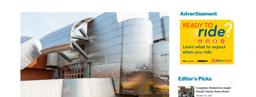
MNDaily.com relaunches with SNO Sites
There were always a hundred reasons not to do it and just as many why they never did, a “big devotion” to the way they’d published online for years foremost among them.
“It’s a big undertaking,” said Dylan Miettinen, editor-in-chief of The Minnesota Daily.
It’s an inarguable fact, especially for a large college newspaper publishing around the clock, that deciding to switch content management systems (CMS) and launch a complete online overhaul is not a decision to be made half-heartedly. It’s a massive commitment, and it’s not without risk.
In spite of the shortcomings of its previous CMS, there had been a certain comfort in standing pat. Past editors shared many of the same issues with their platform and aspirations for change that Miettinen did but opted to stay put anyway. Just keep swimming. No diversions.
And yet, despite likely the most challenging diversion faced in many years (the COVID-19 pandemic), The Minnesota Daily finally made a move.
In September, after several weeks of Miettinen modifying the site from a temporary domain, MNDaily.com, the student news site of the University of Minnesota, went live with SNO Sites.
“It’s a lot of time and energy and work to devote to something like that, but I thought it was something worth that investment,” Miettinen said. “I don’t think the work — articles, videos, podcasts — that any publication produces is the only thing that reflects that news publication. I also think it’s how it appears. With how limited our last content management system was, I knew we could be taking our content to another level and that was a level that would’ve been hard to get to on our old platform.”
The staff’s biggest struggle with their old platform was their limited accessibility to make meaningful, swift changes to the design of the website. The power to customize the website belonged solely to the company that designed it in the first place.
“We could essentially submit requests to say, like, ‘Hey, we want a button here. Here’s what we’re thinking. Is this doable?’ and it would take a bit of correspondence to figure out whether it was doable or not,” Miettinen said. “The whole reason we switched to SNO Sites was to have more autonomy over our content and how it appeared.”
The only way to achieve that kind of autonomy with their previous provider was to have an independent background in coding, which wasn’t a common trait among staffers.
Exchanging that for the abundance of options built into the SNO Dashboard still created a learning curve that took time to get over, but Miettinen said that might have been the most fun part of the experience so far.
“To have something that is a template (but) that isn’t completely set in stone, one that you can really have fun with and do things that you want, have content appear the way you want it to appear, was a lot more liberating,” Miettinen said.
Miettinen said he was influenced by a number of publications in creating the design they have now. They wanted to achieve the kind of white space seen in The New York Times and Star Tribune. Their thin, double dividing lines, for example, are ripped right from NYTimes.com.
Still, Miettinen finds himself sending the SNO Support staff occasional messages when he’s having trouble doing one thing or another. Sometimes, the answer to his questions is just that SNO doesn’t yet have something that can do what he wants it to do. But that’s been OK. Instead, he’s found the WordPress infrastructure that SNO is built on to be extremely helpful.
“Even just like collaborating, where if something isn’t necessarily supported right now, (you’re) finding a middle ground in that (you’re) saying, ‘Oh, you can potentially add this plugin and let’s see how it works,’” Miettinen said. “Because our previous site wasn’t on a WordPress system, we didn’t have that accessibility or capability to build anything out like that because they didn’t have plugins — because they were doing all of the building out (themselves).”
Everything’s been more of a breeze, Miettinen said, all the way from top-level design control to how the staff’s reporters are able to interact with the platform.
FLOW has been a huge upgrade in that respect from their last CMS, he said.
“Creating galleries it’s far easier. Adding videos to our content,” Miettinen said. “It’s really cool to see people take more ownership of the content they produce and be able to make their content look the way they want it to without too much of a hassle.”

